
Cococelli:
Brand Identity
PROJECT OVERVIEW
The goal of this project was to develop a complete brand identity system based on an existing business model within the chocolate industry, applied across packaging, print, and digital platforms. The process involved researching the market, understanding the target audience, and defining clear communication objectives.
For this project, I created Cococelli as a modern chocolate brand centered on sustainability, transparency, and community impact. The identity emphasizes ethical sourcing and inclusive storytelling, focusing on the people behind the product, while exploring logo design, typography, packaging, and cohesive brand applications across multiple touchpoints.
Date: December 2024
Software: Adobe Illustrator and Figma
Design Type: Brand Identity
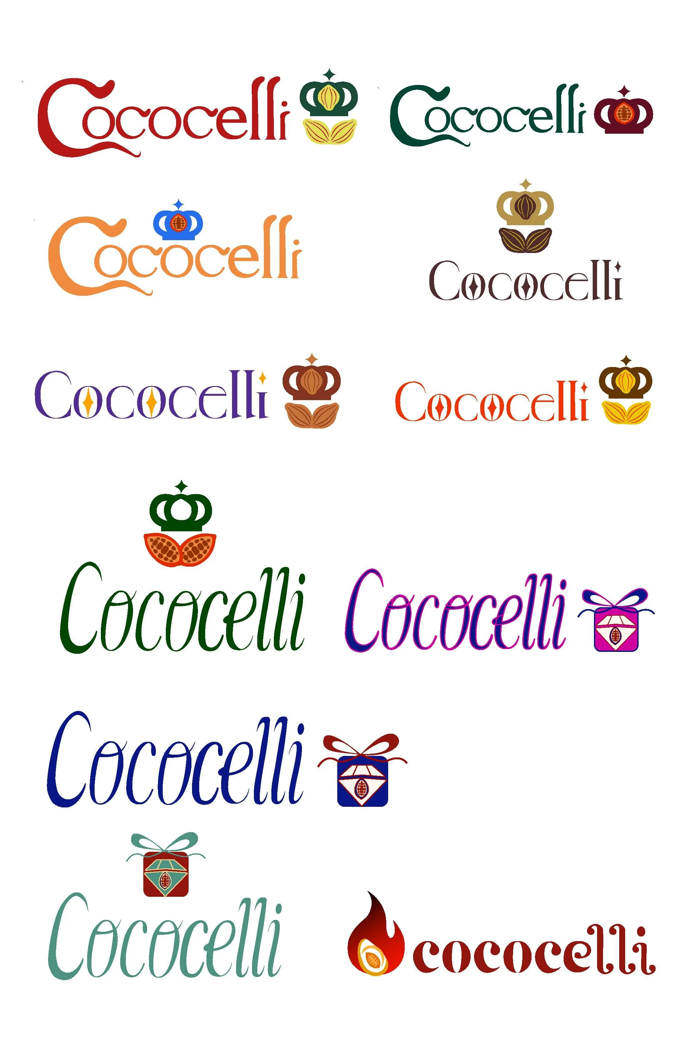
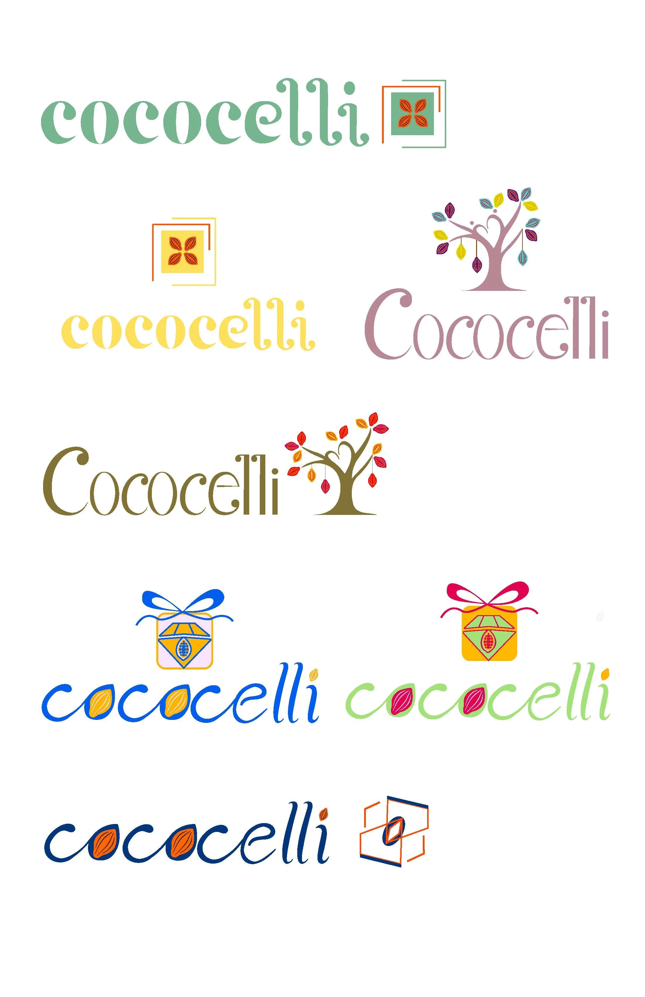
WORDMARK AND TYPE EXPLORATION
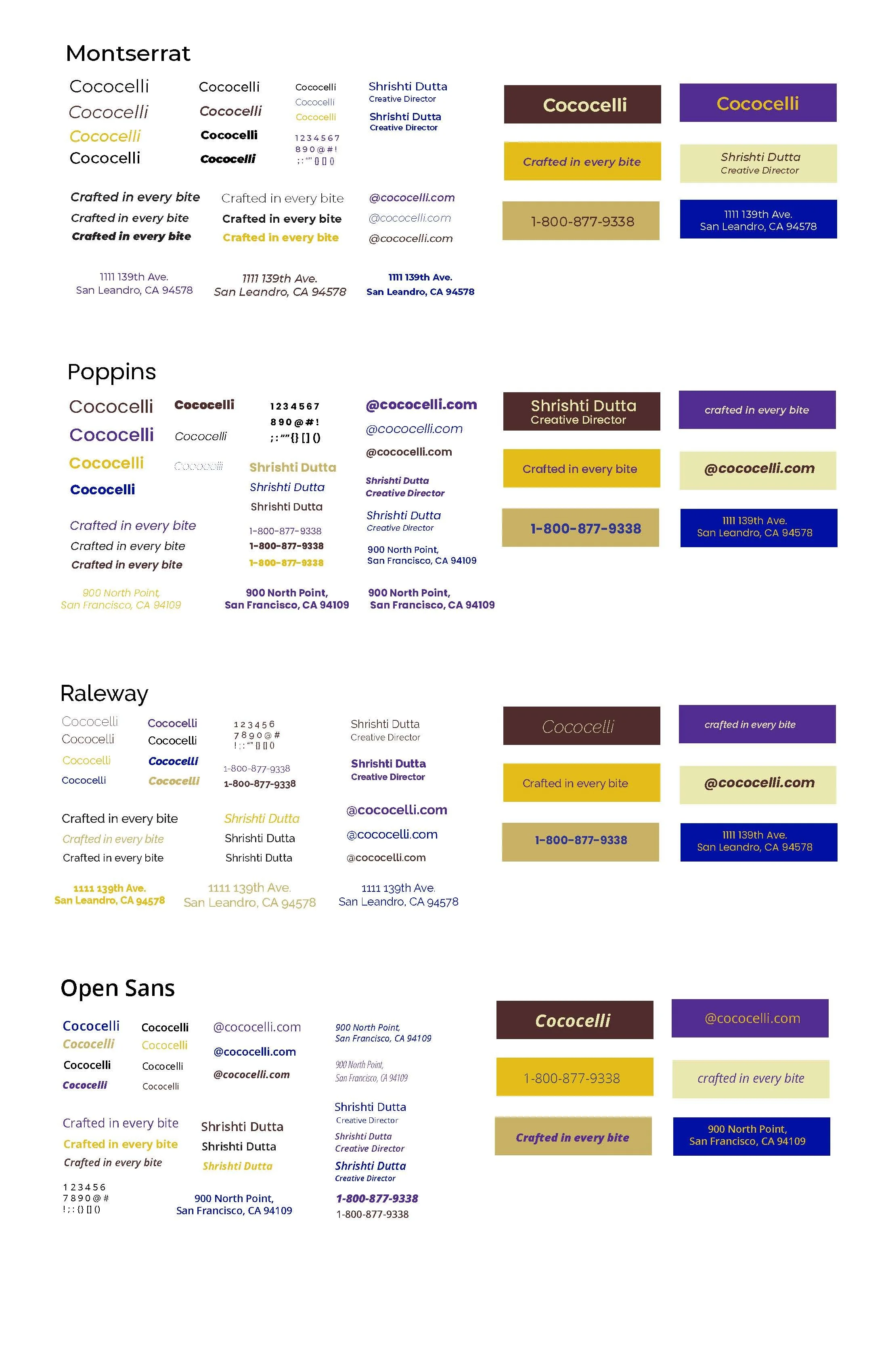
These are some of my initial sketches. At this stage, I focused on exploring the visual identity of Cococelli, considering how to communicate the brand’s values and story through the logotype. I experimented with various symbols and imagery that could reflect the company’s dedication to quality, sustainability, and craftsmanship, alongside different approaches to the wordmark itself. For the type and color studies, I explored a thoughtful font pairing. One font was chosen to echo the custom lettering of the logotype, capturing Cococelli’s artisanal and premium feel, while the other prioritized legibility and a modern touch, reflecting the brand’s contemporary approach to chocolate. Selecting typefaces that supported Vietnamese text while aligning with the brand personality was one of the biggest challenges.
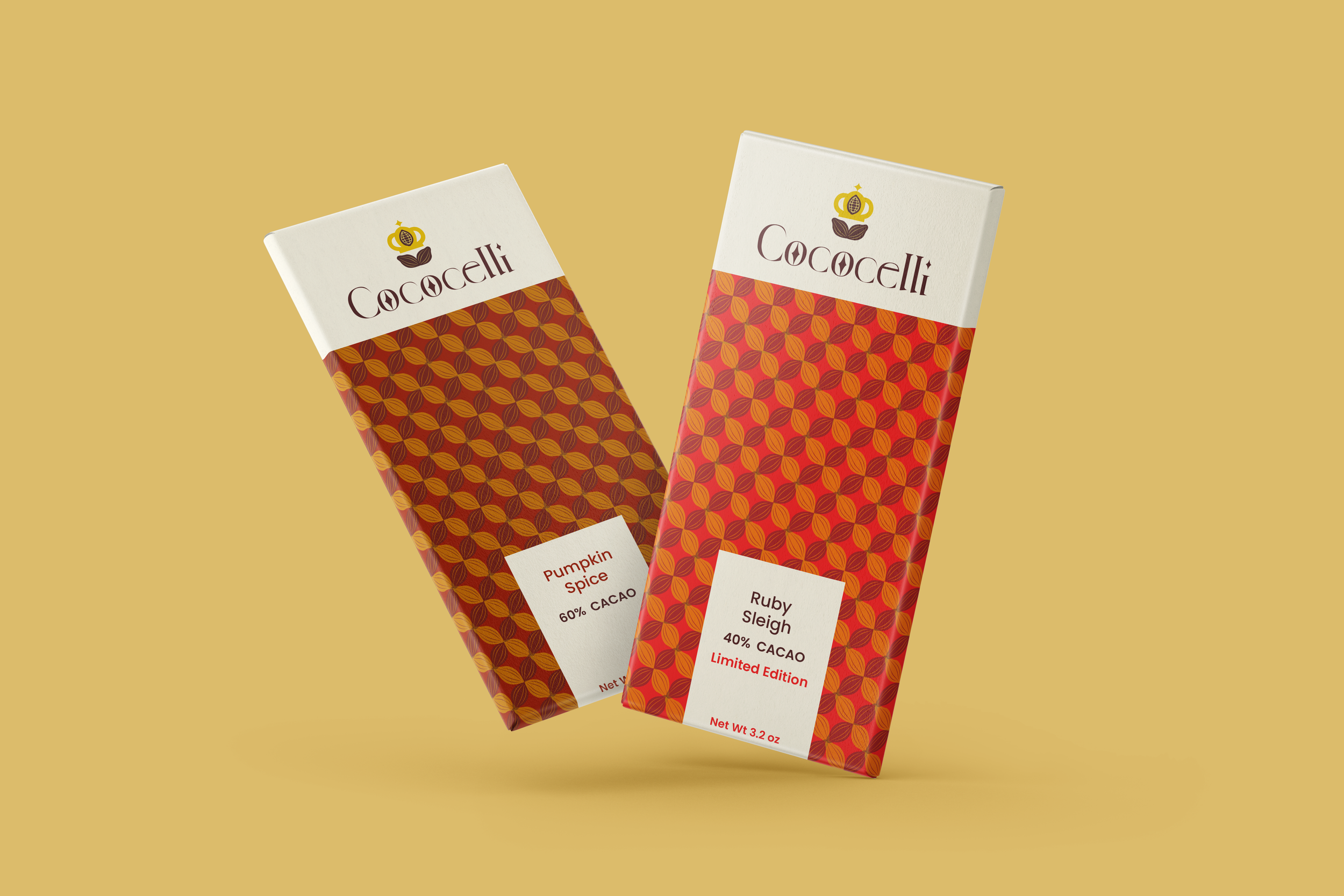
FINAL LOGO
PRIMARY MARK
SECONDARY MARK
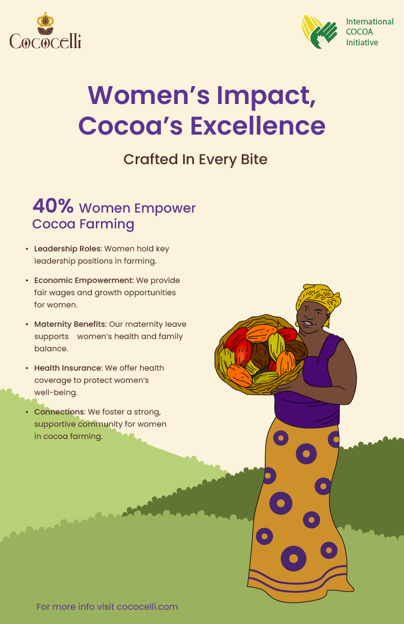
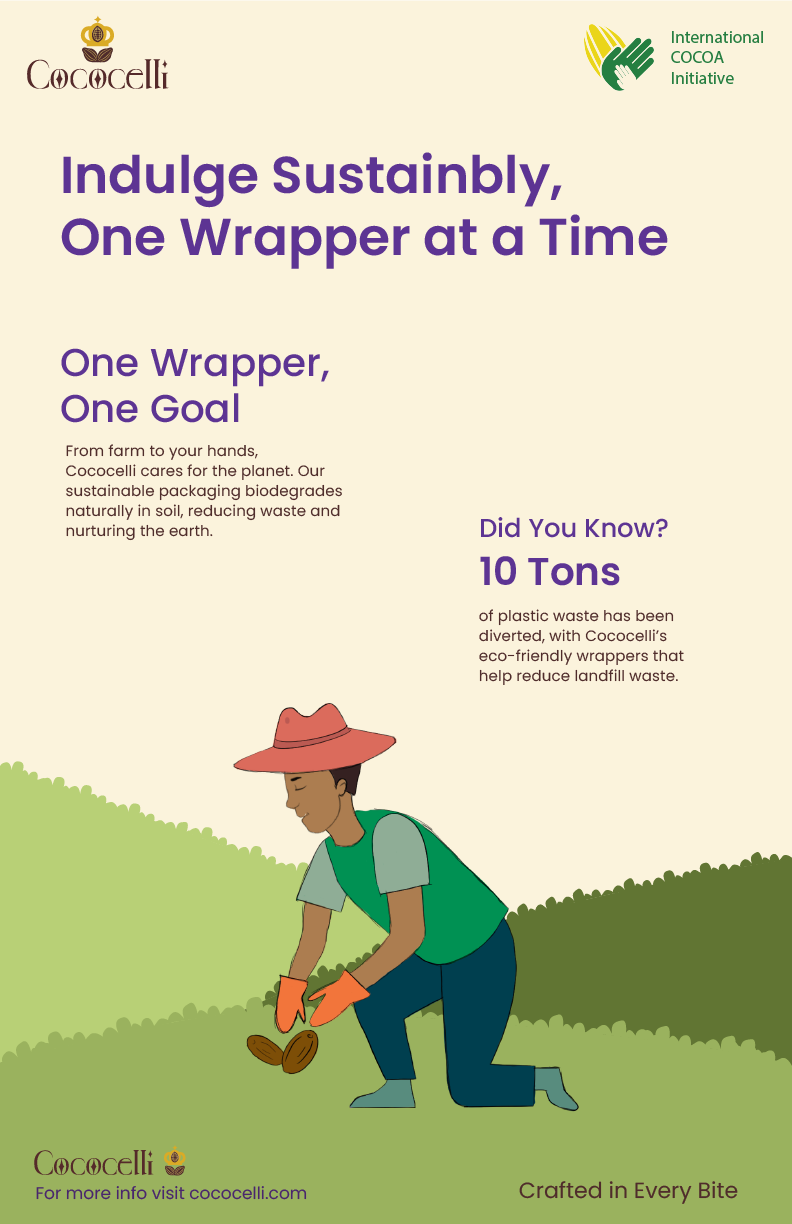
CAMPAIGN POSTERS
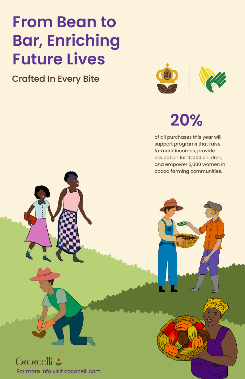
As an extension of the brand, these campaign posters were designed to communicate its core values through storytelling, shifting the focus from the product to the people and processes behind it. The series highlights themes of sustainability, ethical sourcing, women’s empowerment, and community impact within cocoa farming. Using illustration as the primary visual language, the posters create a warm, human-centered narrative, supported by a soft, earthy color palette and simplified forms to maintain clarity while reinforcing the brand’s natural and responsible positioning.
SOCIAL MEDIA APPLICATIONS